Healthcare
Mobile App
Client Project
Redesign
CyberClinic — Redesigning a healthcare app that put aesthetics before usability
A full redesign fixing visual chaos, bloated flows, and broken accessibility — plus five entirely new features built from scratch for patients and doctors.

Services Rendered
UI Screens & Prototype
Role
Solo Product Designer
Tools
Figma
Timeline
2 weeks
AUDIT
What was wrong with the original
With access to the original Figma files, I audited every screen before designing anything. The problems were clear and consistent, this is a product that had prioritised visual polish over actual usability.
Robotic cartoon illustrations on onboarding — cold and untrustworthy for a medical platform
Colour chaos — 4 different background colours across 4 slides with no system or logic
Broken accessibility — text on coloured backgrounds failing contrast checks across multiple screens
No separation between patient and doctor journeys — both went through the same generic flow
Missing post-consultation notes — no workflow for doctors to record clinical observations after a call
"The original had been designed to impress in a portfolio screenshot — not to be used by a patient trying to book a consultation or a doctor trying to write clinical notes after a call."
PROCESS
How the redesign was approached
Before touching a single frame, I established a Figma variable system — the foundation that the original completely lacked. Every colour, spacing value, and type size was tokenised first, then screens were rebuilt on top of that system.
PHASE 1
Audit & mapping
Full analysis of the original Figma files. Every screen catalogued, every UX and visual problem documented.
PHASE 2
Variable system
Figma variable system built before any screen design. Colour tokens, spacing scale, and typography established.
PHASE 3
Redesign & Build
All existing screens rebuilt. Five new flows designed from scratch — including the post-consultation notes system.
BEFORE & AFTER
Section by section
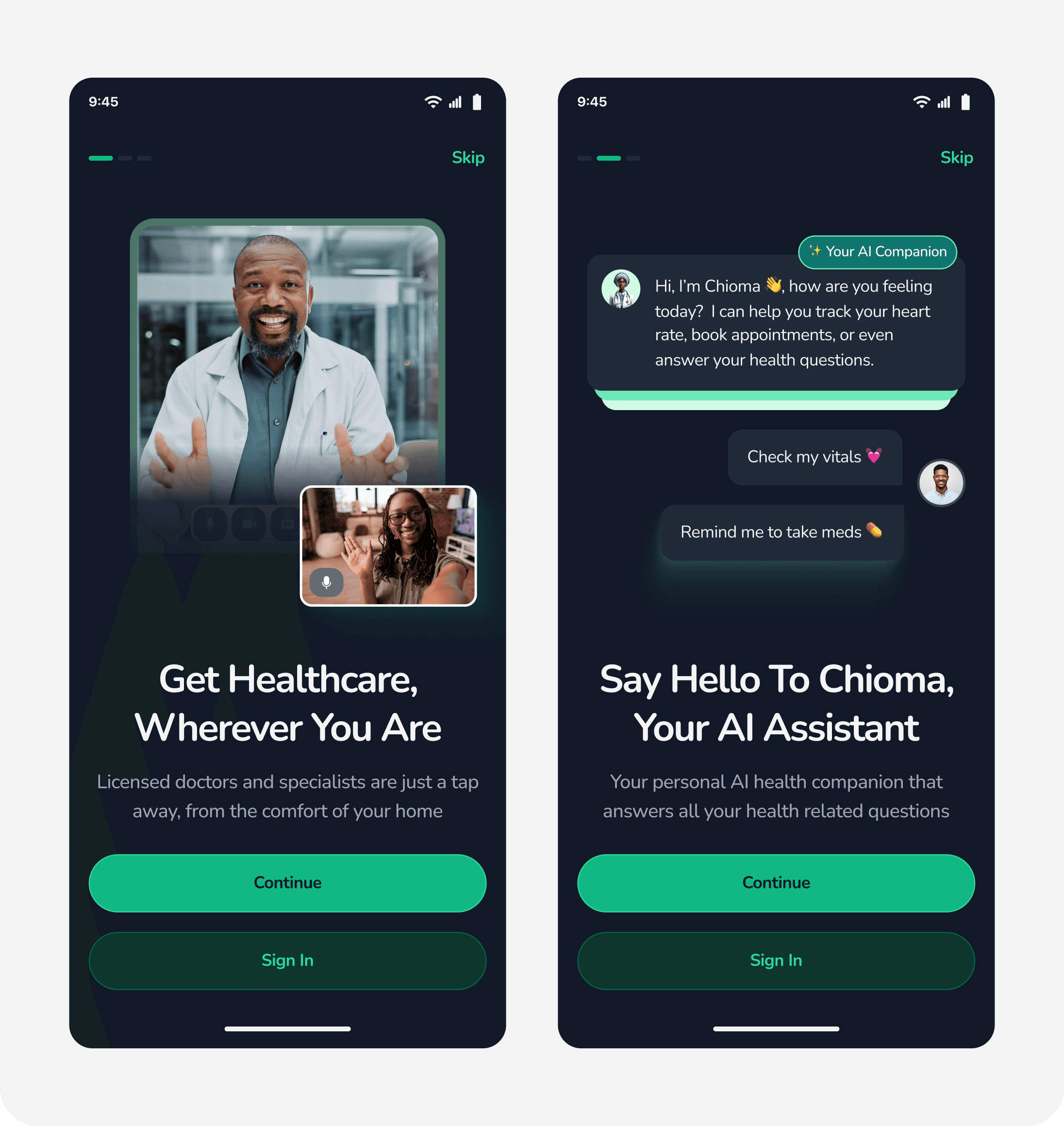
Onboarding — from robot cartoons to real healthcare
6 clashing slides with robotic illustrations replaced with 3 clean dark screens using real photography, human copy, and proper CTA hierarchy.
BEFORE

Problems identified
4 clashing background colours · Robotic cartoon illustrations · Arrow-only CTA · No brand consistency
AFTER
Improvements
Consistent dark theme · Real photography · Clear CTA hierarchy · 6 slides → 3 slides
Profile creation — killing the avatar, splitting the journey
Avatar selection removed entirely. Patient and doctor registration paths now split at account type selection, with doctors getting a dedicated MDCN credential verification screen.
BEFORE

Problems identified
Irrelevant avatar step · Aggressive inline validation · No patient/doctor path separation · OTP with padlock illustration
AFTER

Improvements
Avatar removed · Clean sign-up flow · Patient/doctor paths split · Doctor credential verification screen added
Appointment booking — purposeful flow replacing empty states
Cartoon calendar empty state replaced with a structured Appointment Hub, a consolidated booking form, and a filterable doctor list with Chioma's Match clearly positioned.

FULL REDESIGN


